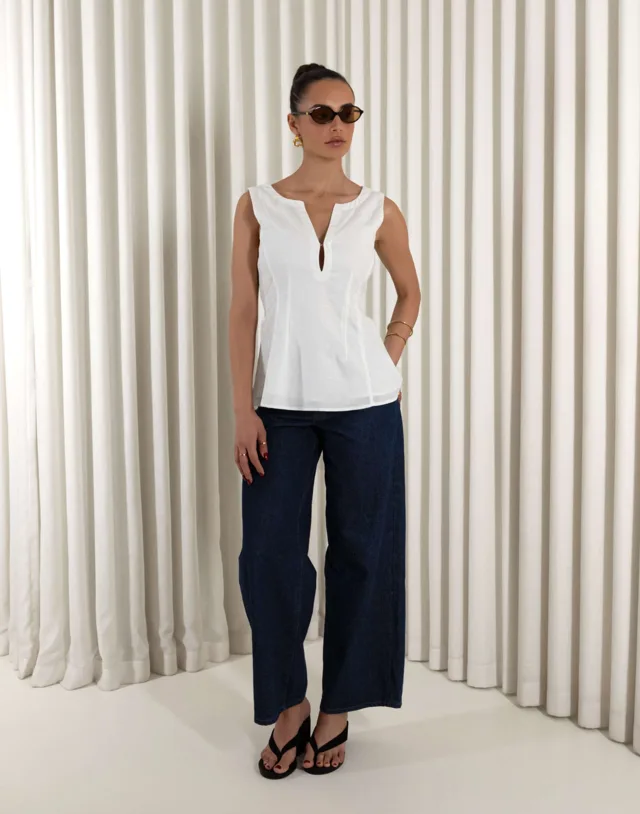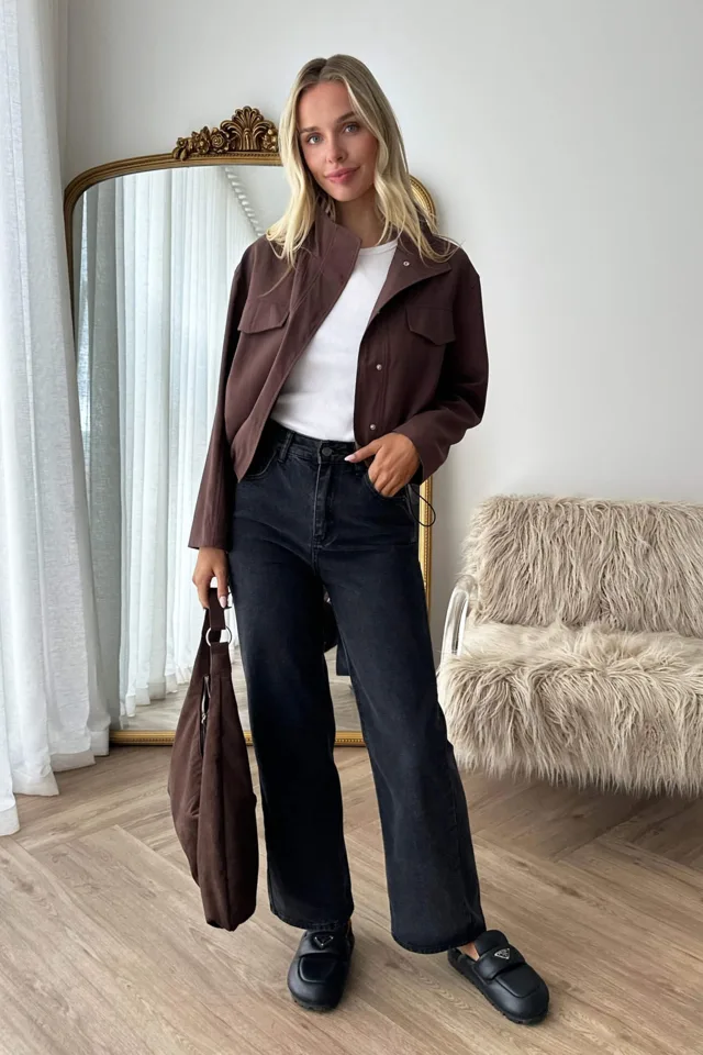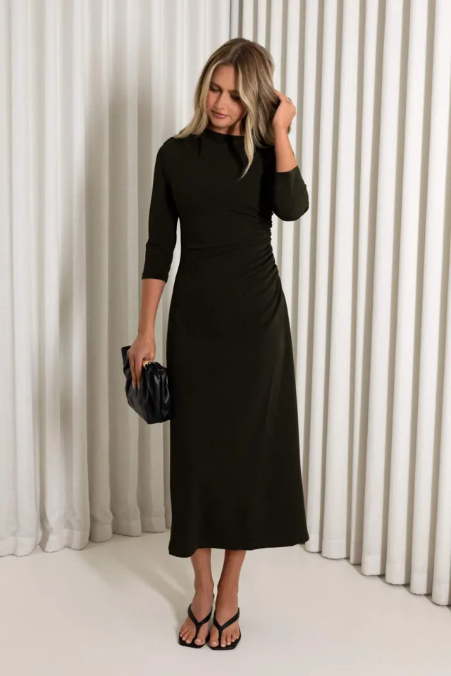
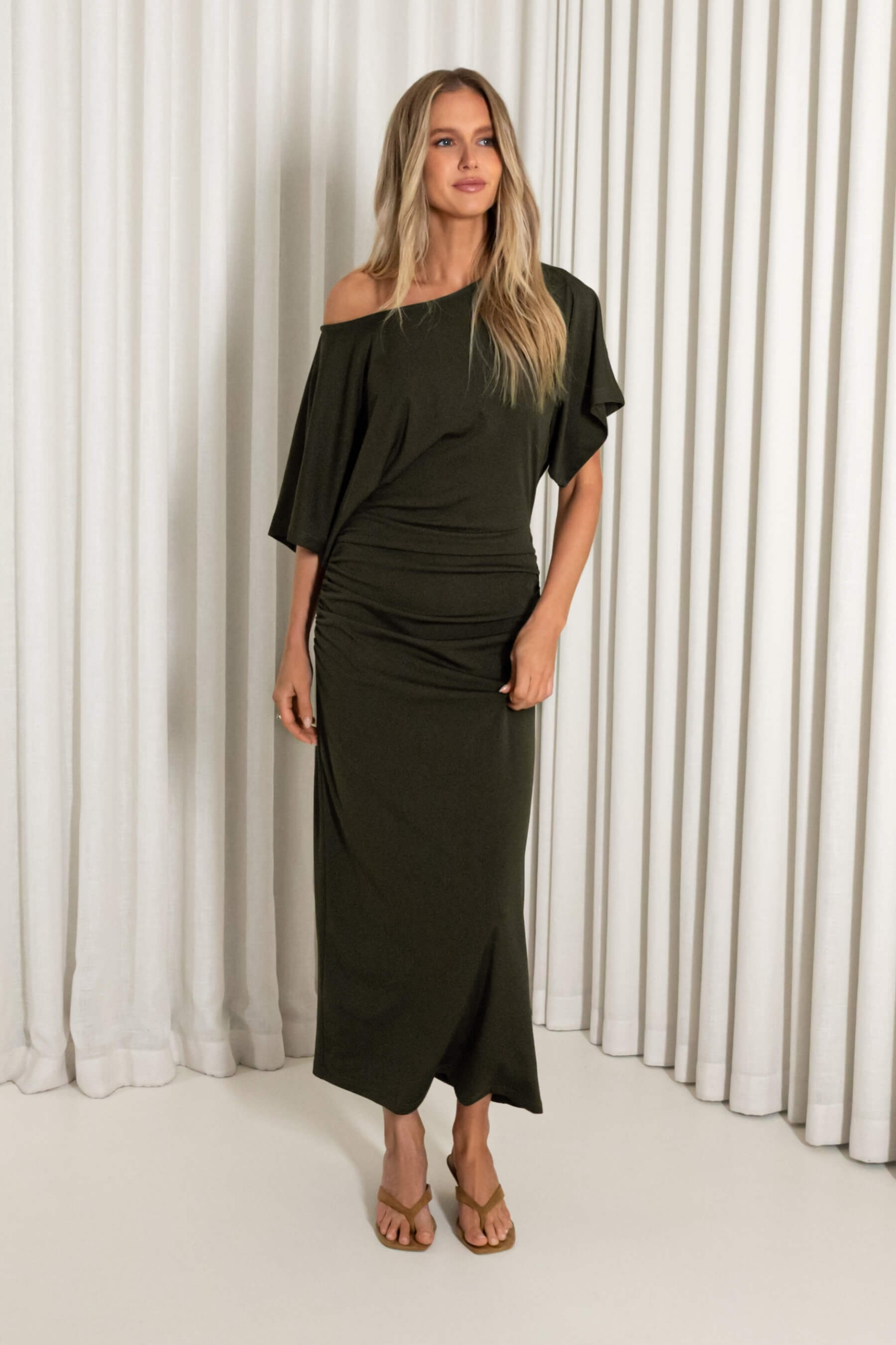
A boutique display can feel polished without being complicated. One useful starting point is a color story: a small, deliberate group of hues that helps shoppers understand how garments and accessories might work together. Thoughtful boutique merchandising uses color to guide the eye, clarify choices, and suggest outfits while leaving room for personal style.
A color story is not a demand that every item match. It is a flexible editing tool for arranging a selection, whether the focus is a rack, a table, or a shop window. With a little retail display planning, a cohesive arrangement can feel inviting and practical rather than stiff. The aim is to make browsing easier and help each piece read clearly on its own.
Begin with a simple color direction
Choose a starting point that makes sense for the merchandise in front of you. It might be a neutral base with one noticeable accent, a family of related earthy shades, or a print that already combines several colors. Limit the initial palette to a few main tones, then decide which supporting shades can sit comfortably beside them.
Think in terms of roles. A base color can anchor the display; a secondary shade can add variety; and a smaller accent can bring focus. These roles are guides, not quotas. If a collection has more variety, select a narrower section for the story rather than forcing every garment into the same arrangement. A considered edit will usually communicate more clearly than a crowded rack with no visual pause.
Use prints as a bridge between pieces
A print can connect colors that might otherwise seem unrelated. Look at the colors present in the pattern, then use one of its less prominent tones to pair with a solid garment or accessory. This approach creates a link without repeating the print across the whole display.
For example, the brown and pink palette named in the Hathaway Floral Dress can suggest a warm-toned grouping. Use a nearby solid as a quieter companion, and let the printed piece remain easy to notice. When styling a mannequin or outfit, keep the number of competing patterns modest so each element has space to register. The point is coordination, not uniformity.
Arrange color to support browsing
Color placement affects where the eye travels. A gradual transition from light to dark can make a rack feel orderly, while grouping similar shades together can help shoppers compare options. Either method can work; choose the one that makes the merchandise easiest to scan. Avoid placing every strong color in one dense block if it makes the display feel visually heavy.
Build in breathing room. Leave enough separation for customers to see garment shapes and move hangers comfortably. On a table, arrange folded pieces so colors remain visible without stacking so high that the lower items disappear. Keep signs and accessories from covering important details. For a broader look at the available range, connect the display to the Dresses collection where shoppers can continue exploring.
Balance color with silhouette and proportion
A useful outfit story shows more than matching hues. Consider how lengths, shapes, and layers relate. A fitted-looking piece can be balanced by a more relaxed layer, while a longer line may pair well with a compact accessory. These are styling possibilities, not rules about who should wear what. The best combination is one that feels comfortable and expressive to the person choosing it.
When building a display outfit, vary proportions with intention: try a shorter layer over a longer garment, or keep the outer layer open to show the line beneath. A dress can be presented with an optional belt, lightweight layer, or simple jewelry when those pieces suit the mood. Show enough of the garment to make its shape legible, and avoid adding so many accessories that shoppers lose sight of the main item. For shoppers comparing garment details, provide a clear route to the size guide.
Choose layers and accessories with restraint
Layers help demonstrate how a piece might work across changing plans or temperatures. A cardigan, jacket, or wrap can introduce another color while showing a practical styling option. Keep the layer visually compatible with the palette and make sure it does not obscure the neckline, sleeves, or other details that matter to the presentation.
Accessories can repeat an accent color or add a contrasting note. Choose one or two focal accessories rather than filling every available space. A bag or pair of earrings may be enough to suggest an outfit direction. If a display includes multiple items, make each choice purposeful: an accessory should support the story, not imply that every component is required. Leave room for customers to imagine their own combinations.
Let fabric guide handling and care
Color is only one part of a garment’s presentation. Fabric texture, drape, and construction affect how an item hangs, folds, and responds to repeated handling. Give delicate-looking details enough space, use suitable hangers, and avoid overstuffing a rail. Fold pieces neatly where that makes sense, but keep the fold from hiding a key feature or creating unnecessary creases.
Care information should come from the garment’s own label or product details, not guesswork based on color or appearance. Avoid promising that a fabric will keep a particular shape or finish. When refreshing the display, handle garments thoughtfully, check that accessories are secure, and return items to a presentation that lets their color and silhouette show honestly.
Refresh the story with a flexible process
A display does not need a full reset whenever one piece moves. Start by checking whether the central palette still reads clearly. If a gap appears, shift neighboring items, change the order, or replace a supporting piece with another that fits the same color direction. If the story has become too repetitive, introduce contrast through a different shade, texture, or silhouette.
Use a short review before opening or after a busy period: Can shoppers identify the featured colors? Are the garments easy to browse? Does the outfit suggestion leave room for individual interpretation? Is anything blocking a product detail? Those questions keep retail display planning practical and responsive rather than fixed. If the work is part of a broader buying or assortment conversation, the wholesale inquiry page offers a next step for relevant business questions.
Make clarity the measure of success
Strong boutique merchandising does not require a perfect palette or an elaborate installation. It asks for a clear point of view, thoughtful spacing, and styling choices that help shoppers see possibilities. Begin with a manageable color story, let prints and solids speak to one another, and balance garments with proportion, layers, and a few considered accessories.
Then give the arrangement room to evolve. A flexible display can respond to the pieces people are browsing without losing its visual thread. When each item remains visible and the combinations feel approachable, color becomes a helpful guide—not a restriction—and the boutique feels easier to explore.
Find a piece to make it your own.
Explore the current collection and ask us about the fit, details or availability of any style.
Explore Dresses